
Art Direction
//
UI Design
//
Layout Concepting & Templating
//
Production
//
Art Direction // UI Design // Layout Concepting & Templating // Production //
PubPass® Welcome Email Series
CLIENT: PubPass® - America’s Favorite Craft Beer Passport
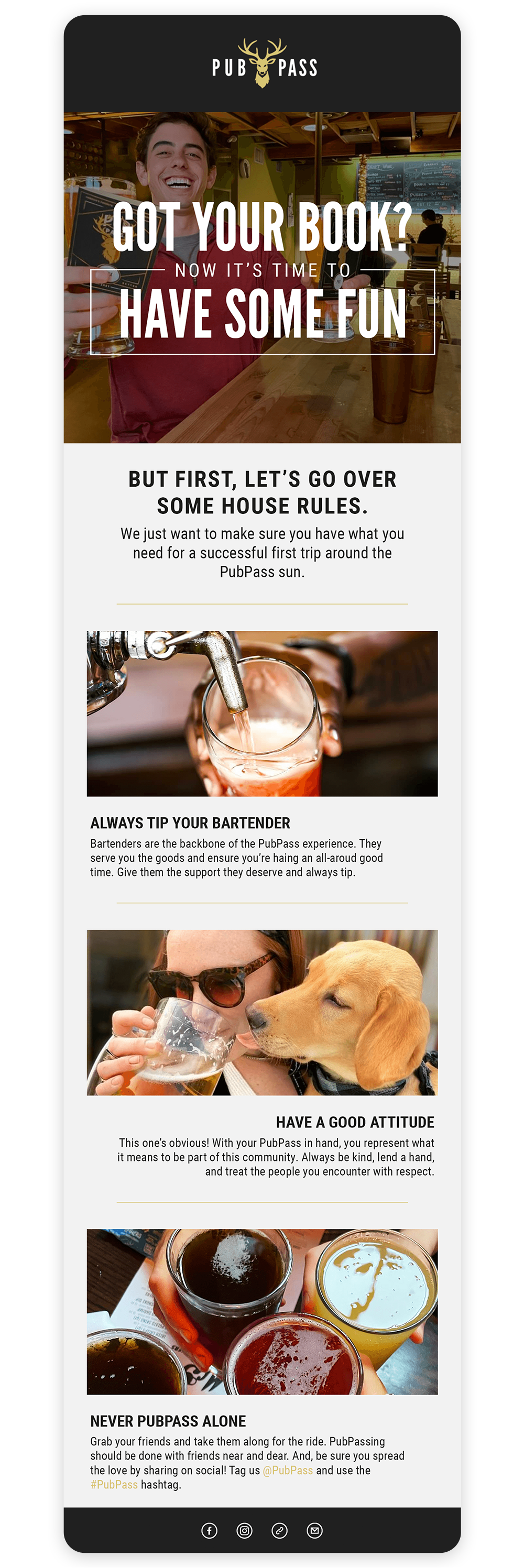
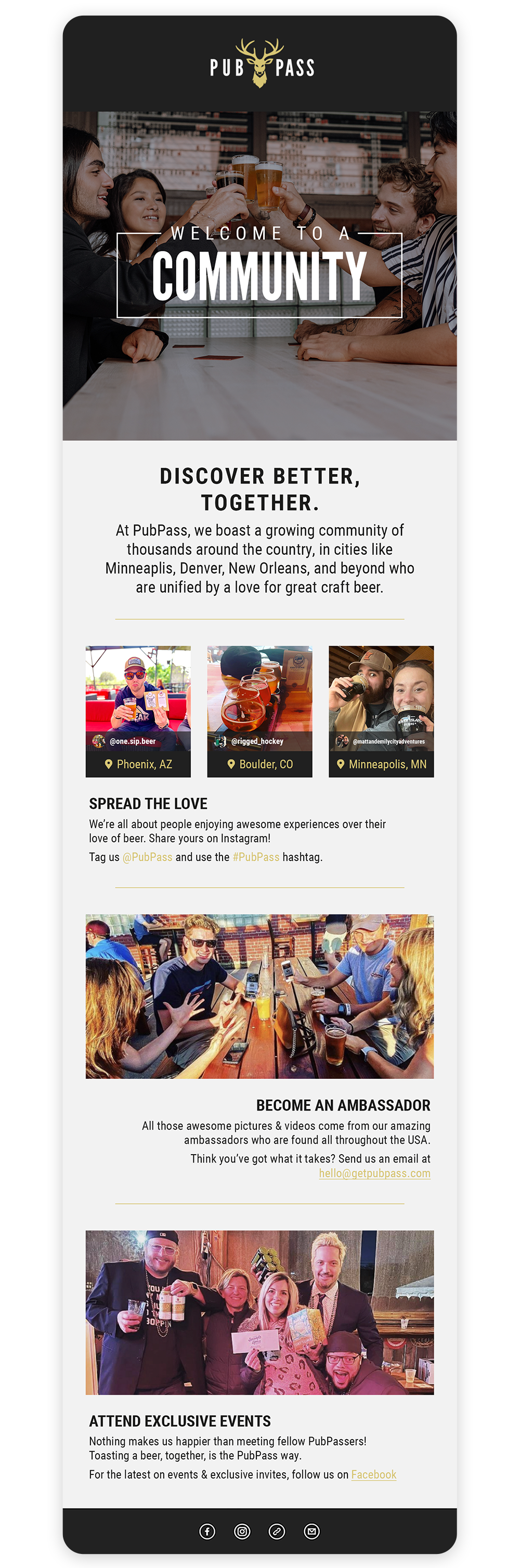
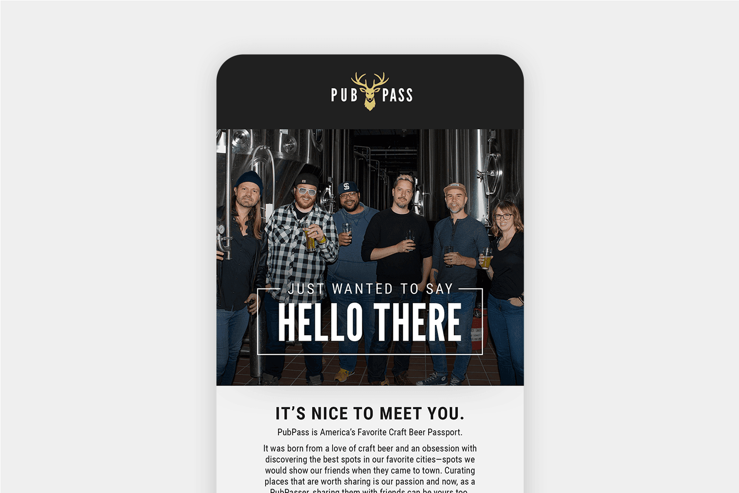
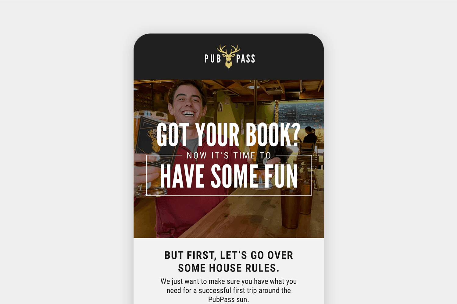
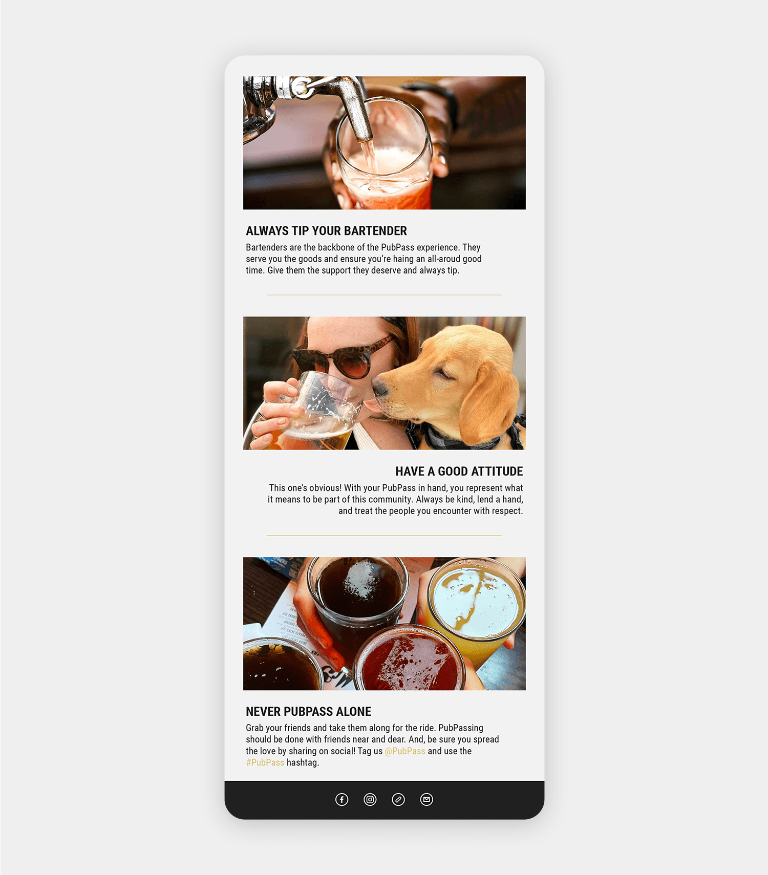
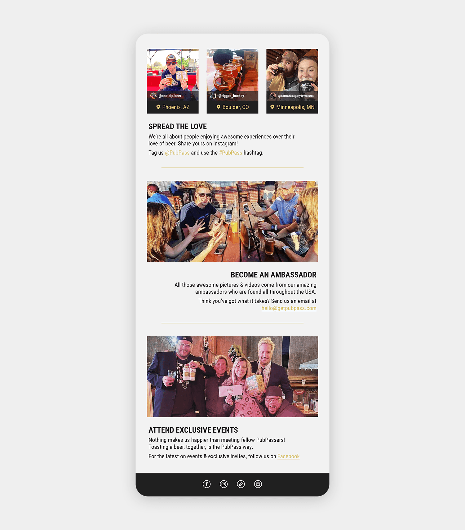
First impressions are important, and PubPass® wanted theirs buttoned up. With goals of strengthening their brand presence and creating consistency across channels, I worked with their team to build a series of email layouts that help first-purchasers get to know the brand, have a smooth experience with their passport, and familiarize themselves with resources available should they have any questions.
New email type standards were developed, and various sections/layouts were templated, giving PubPass® the ability to easily maintain consistency and make future updates.
// Final Layouts //
A Strong, Branded Experience
With imagery that focuses on people, beer, and sharing brews with friends, you know what’s important to PubPass®—community and discovery.

Minimal Brand Elements, Maximized
The minimal PubPass® brand called for a limited color palette. Backgrounds are shaded a light grey to keep dark text easy on the eyes, with an accent color that screams, “Beer!” Type was kept simple as well, relying on Roboto Condensed throughout, knowing that most email clients will display a default sans-serif instead.
Friendly Icons for a Quick Read
Using the brand’s existing icons as my style guide, I created four new icons for use in the FAQ/Resources send, on the PubPass® website, and social channels.
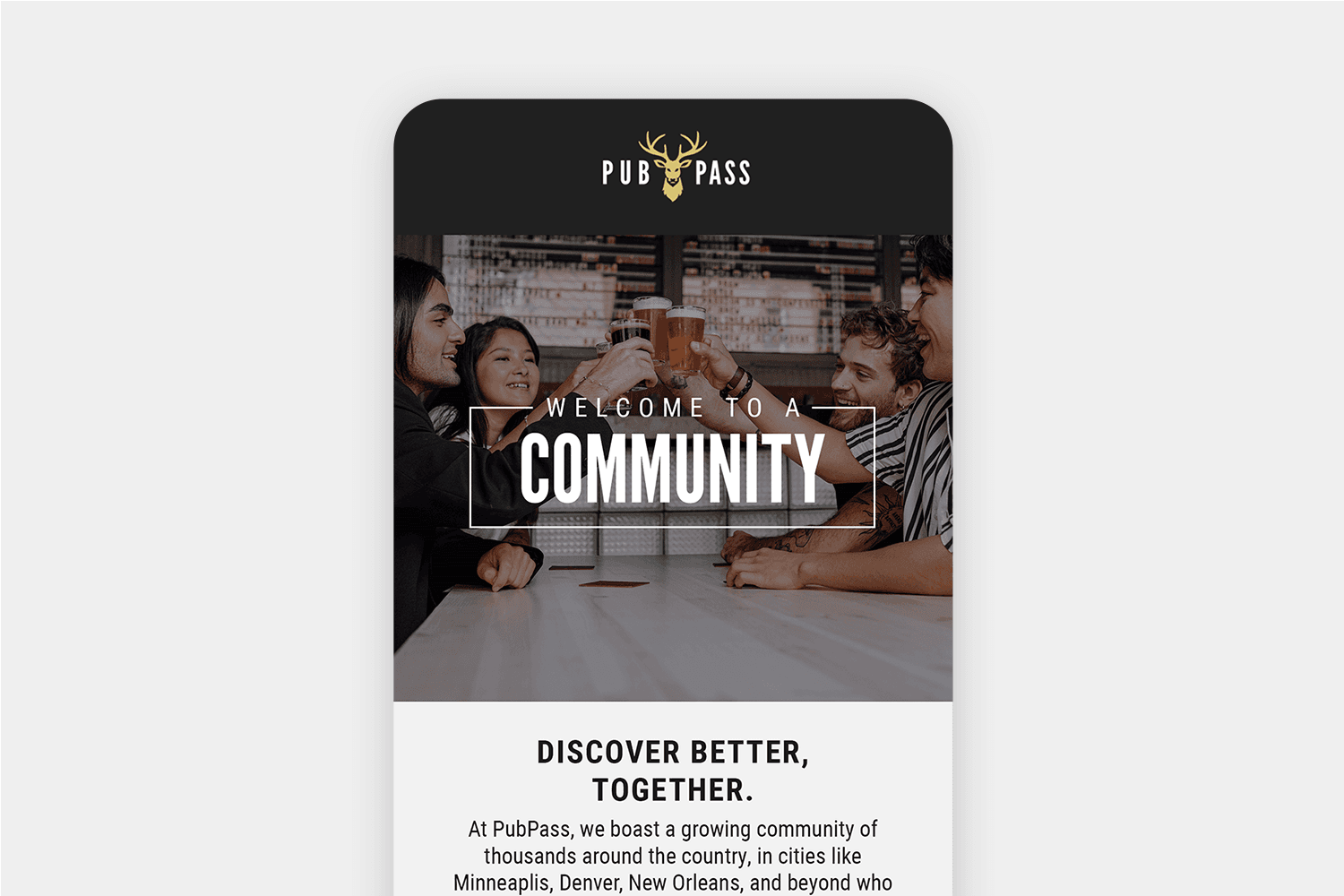
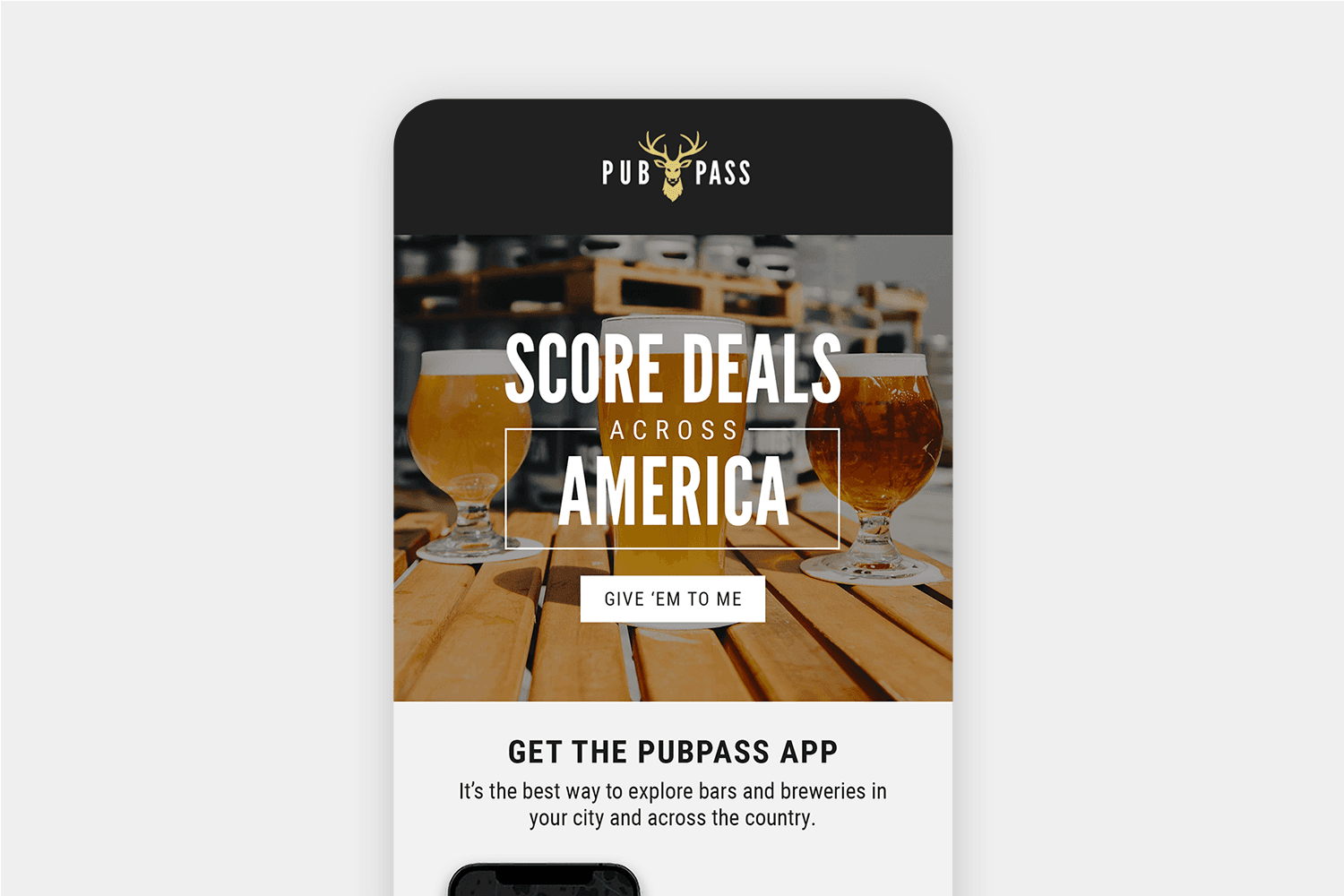
Easily Updated Text Lockups
Text lockups for hero graphics were templated so that they can be easily updated with fresh language for any future promotions or messaging.
Ready to Go, Again & Again
These text-image layouts are the brand’s most common send, so I developed an easily repeatable layout template, allowing PubPass® to maintain consistency in any future updates, and to build their own fresh sends that match perfectly.